

Everyone knows that markets ebb and flow in bull and bear market cycles. But individual sectors tend to drive these changes, sometimes almost entirely independent of the broader market trends. When markets rise sharply, it’s easy to lose sight of what’s really driving the gains. Often, it isn’t the whole market at all–it’s a handful of sectors pulling the weight. Understanding which parts of the market are doing the heavy lifting–and why–helps investors stay grounded when the headlines make everything look easy. If a portfolio is heavily exposed to one or more hot sectors, the portfolio itself can experience strong gains, but by itself, performance it tells you nothing about the future – both for the sectors that performed well, as well as the ones that didn’t.
While an in-favor sector can deliver strong results, they also pose a less obvious risk: they can distort your perception of performance, risk, and your personal expectations. In recent years, financial markets have seen waves of sector-driven rallies, particularly in areas like technology, AI, and green energy, among others.
Let’s first take a look at sector performance over the past several years.
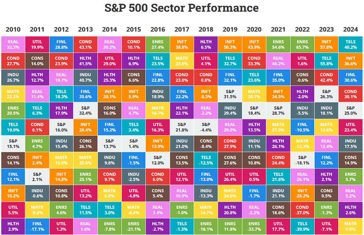
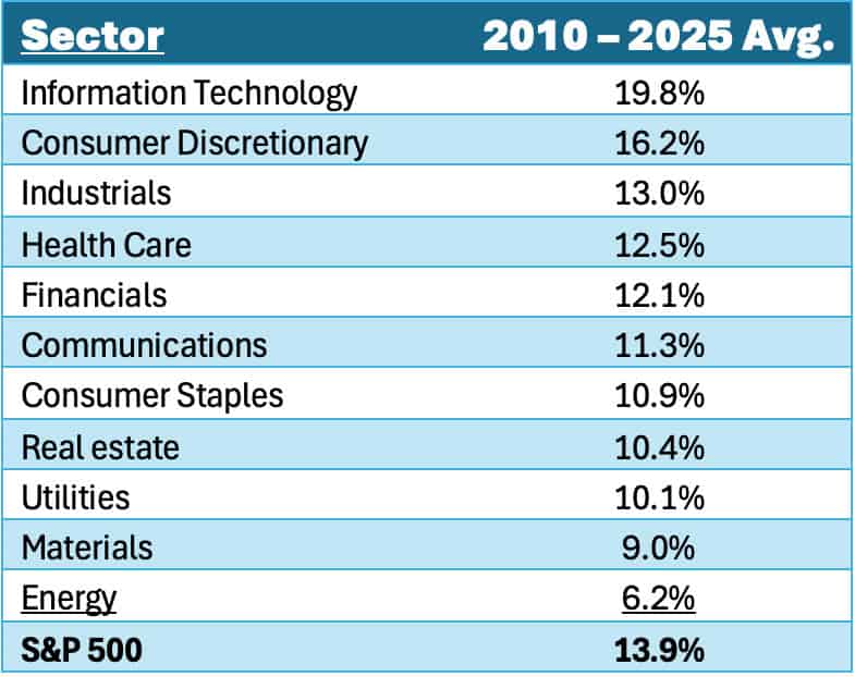
The previous table is what is known as a ‘Sector Quilt’ where each sector is ranked according to its returns in that year (from lowest to highest). Because each sector is color-coded, it is easy to follow a given sector’s returns over time. For instance, the Information Technology sector (color-coded orange) was sluggish out of the gate where it ranked 7 out of 11 sectors in 2010, but it also scored in the top 4 performing sectors in 9 of the remaining 14 years. In fact, over the entire 2010 – 2025 time frame, Information Technology has been the single best performing sector, returning nearly 20% per year.
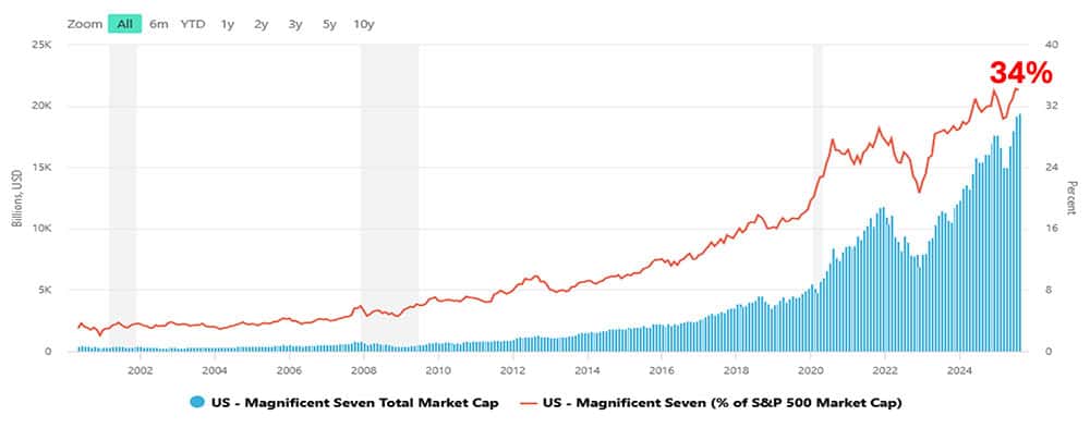
This shouldn’t come as a surprise because many of these companies are now household names, including Apple, Microsoft, Nvidia, Amazon, Meta (Facebook), Alphabet (Google), and Tesla, among many others. In fact, this list has come to be known as the Magnificent 7, as much for their product’s transformative impact on our lives as well as on the value of our portfolios. What might be surprising is the sheer size of these companies today, with each of the Magnificent 7 sporting trillion-dollar market caps. The largest of these is Nvidia coming in at an astonishing $4.5 trillion market cap. In fact, the combined market capitalization of the Magnificent 7 is roughly $20 trillion. For perspective, Nvidia’s market cap alone is bigger than the market caps of the UK, Canada, Australia and Latin America. Similarly, the combined market cap of the Magnificent 7 is larger than the market caps of China, EU, Japan, India and Africa. In short, these companies are enormous and are now driving markets.
Back in 2010, the Mag 7 comprised about 7% of the S&P 500 by market cap. But when compared to the S&P 500 today, the Magnificent 7 is now 34% of the S&P 500, as illustrated by the red line in the following exhibit.
Magnificent Seven Total Market Cap & Share of S&P 500
The spectacular growth of these companies over the past 10-20 years has indeed been epic, but as they have grown to dominate the stock market tables, they have also grown to dominate the headlines (not to mention our lives). This extraordinary growth has now become the baseline for our expectations not just for these stocks, but for stocks in general. This is known in psychology as a Status Quo bias where we have a powerful tendency to expect the status quo to continue. In this case, the status quo is that the Magnificent 7 are world beaters that will grow to the sky. This theme has been drilled into the minds of the investing public over the past 15+ years with returns that have averaged about 20% over this time frame. It’s also worth noting that the second highest performing sector was Consumer Discretionary at about 16% per year, influenced in no small part by the inclusion of Amazon and Tesla.
But what does all this mean for the other 493 stocks in the S&P 500, also known as the Forgotten 493? As the Magnificent 7 has grown, the P/E ratios of the Magnificent 7 and the Forgotten 493 have diverged dramatically, as illustrated in the graph below.
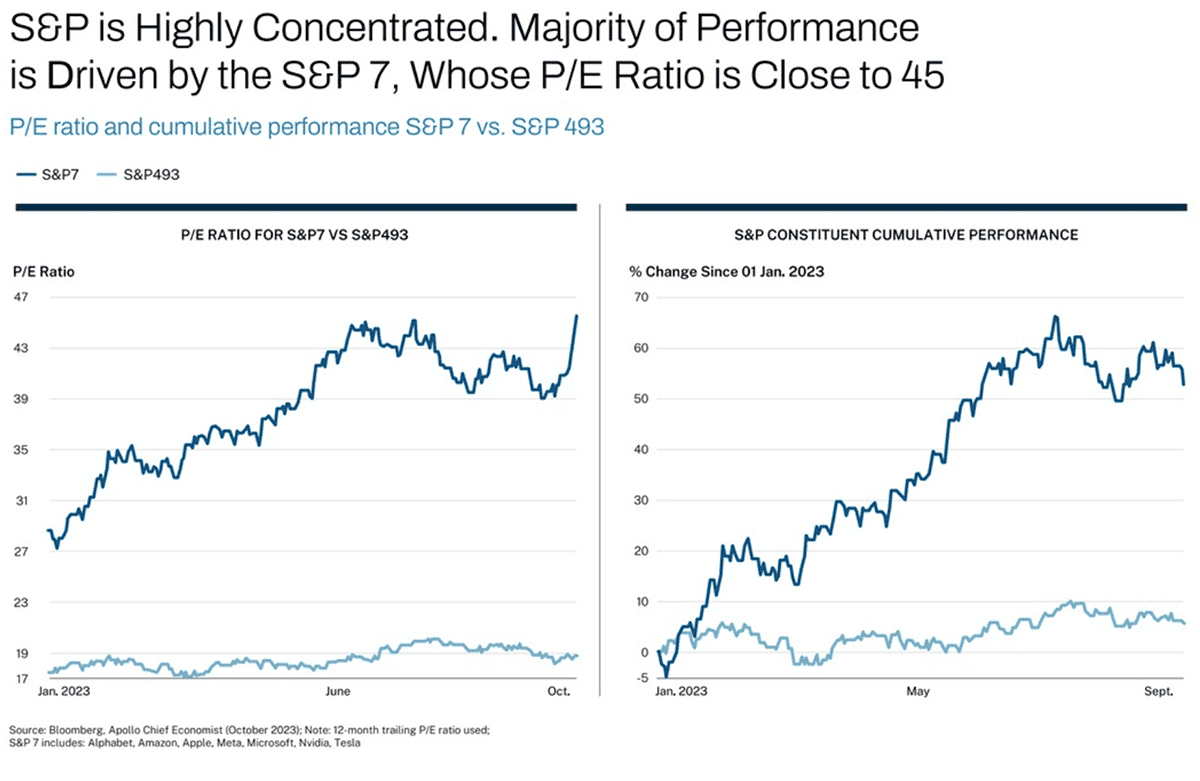
In essence, the market’s expectations for the Magnificent 7 have exploded with its p/e reaching 46x. And while the P/E ratio for the Forgotten 493 at 19x isn’t cheap historically, it is still much more reasonable on its face than the 46x for the Magnificent 7.
The purpose of this article is neither to exhort the merits of the Magnificent 7, nor the Forgotten 493, but simply to emphasize that baseline expectations have been set and investors from this day forward will reap the rewards or consequences accordingly. The Mag 7 is no longer the tail wagging the dog. It’s the dog.
When a small number of sectors dominate returns, it becomes difficult for most diversified portfolios to keep up – even when they are performing reasonably well. This gap creates the illusion that you’re missing out, when in reality your portfolio might be efficiently positioned to weather the next storm or shift in market sentiment.
People are people, and we tend to chase shiny objects for fear that we are missing out on something better. Beware of natural biases we all battle in the fight to stay disciplined. Sector driven rallies are exciting and can create enormous wealth. But they also distort reality. They make broad indexes seem stronger than they are, diversified portfolios seem weaker than they are, and concentrated bets seem safer than they are. Always remain anchored into the fundamentals of investing – your goals, your risk tolerance, your ability to absorb losses and still meet your goals. If your portfolio is designed to endure and meet your goals, then everything else is just noise.
Related Articles

Historical examples of hot sectors that didn’t end well
History of Markets,
Investment Principles,
Knowledge & Insights,
Markets,
Top Investor Mistakes,
July 11, 2024

How Can I Teach my Kids How to Save and Invest Wisely?
Personal Finance,
Top Personal Finance FAQs,
November 7, 2024

How Do Recent Returns Impact Average Returns?
Investment Principles,
Top Investment Principles FAQs,
Understanding Results,
November 19, 2024